Visual consistency kills momentum. For product teams and solo designers, the high-level concept isn’t the bottleneck; the grunt work is. You don’t struggle with the big idea. You struggle to maintain a coherent visual language at scale without hiring a full-time iconographer. The real headache during roadmap meetings isn’t the feature set-it’s how to ensure the “settings” gear matches the “user” profile perfectly in stroke weight, corner radius, and perspective.
Icons8 answers this by treating design as a manufacturing problem rather than an art project. Unlike marketplaces where disparate styles from thousands of authors collide, this platform operates like a factory. They produce over 1.4 million icons in-house, adhering to strict guidelines across 45+ visual styles.
Systematizing the Icon Workflow
Coverage is the killer feature here. Relying on open-source packs like Feather or Heroicons often leads to a dead end. You have the basics, but the moment you need a niche asset-say, “database-migration” or “customer-churn”-the pack comes up empty. You are forced to draw it yourself or mix in a mismatched asset.
Icons8 solves this by brute force. Popular styles like iOS 17, Material Outlined, and Windows 11 aren’t just samples; they are deep libraries populated with over 10,000 icons each. You can likely finish a complex dashboard without ever leaving your chosen style family.
Scenario: The Enterprise SaaS Migration
Imagine a product team migrating a legacy desktop application to a web-based SaaS platform. The mandate is clear: the interface must feel native to Windows 11 users. Iconography must adhere strictly to Microsoft’s Fluent Design system.
The Discovery Phase
The lead designer selects “Windows 11 Color” in the library. Single downloads are inefficient, so they use the Collections feature. As they audit the legacy software, they search for equivalents: “server,” “cloud-upload,” “API-integration,” and “firewall.”
Handling Niche Requests
Then comes the specific need for a “data-breach” icon. Small libraries fail here, requiring custom illustration. But this search yields multiple options within the Windows 11 style. Since the library is built in-house, visual metaphors remain consistent. The shield in the security icon shares the exact geometry of the shield in “admin-privileges.”
Handoff and Implementation
Collection built. Export time. Paid plans unlock SVGs. The team unchecks “Simplified SVG” for assets destined for CSS animation, preserving editable paths. For static menu items, they generate a font file directly from the Collection tab. Developers implement a web font; designers stop managing hundreds of individual SVG files.
Scenario: The Rapid Marketing Campaign
Marketing teams operate on different timelines. Speed matters more than code-ready vectors. A content manager building a slide deck for a product launch usually lacks access to Illustrator.
Browser-Based Customization
The manager spots a “rocket launch” icon in the “3D Fluency” style. It matches the campaign’s playful tone, but the default colors clash with company branding. Instead of waiting for a designer, they use the in-browser editor.
On-the-Fly Editing
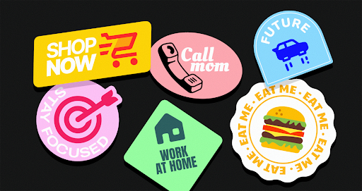
Clicking the icon opens the overlay editor. They use the Recolor tool, inputting the specific brand HEX code to shift primary hues. Next, they add a background element. Selecting the “Square” add-on, they change it to a circle (Filled mode with rounded corners) and adjust padding to create a sticker effect.
Integration
Social proof elements are required for the contact slide. They grab the facebook logo and use the editor to strip it to a monochrome version that sits quietly in the footer. Finally, they download assets as 1600px PNGs. High resolution ensures a crisp presentation on 4K monitors without ever opening Photoshop.
A Narrative: Prototyping Speed Run
UI designers live in chaos. Let’s look at a typical morning using the Mac app, Pichon.
Figma is open. Pichon floats as a window on top. The designer needs a navigation bar set. They toggle the category to “iOS 17 Outlined” to ensure Apple guideline compliance. Type “home.” Drag the icon directly onto the Figma canvas. It lands as a scalable vector.
Next up: a “profile” icon. They drag it in but realize the stroke weight looks anemic against the dark background. No manual border tweaking required. They switch the toggle in Pichon to “iOS 17 Filled.” The library instantly updates. Drag the filled version in.
Later, a “scan QR code” feature needs attention. Static icons won’t do; it needs animation to guide the user. Filtering by “Animated” reveals a Lottie JSON file of a scanning reticle. They hand that off to the developer. Three minutes elapsed. Zero browser tabs opened.
Comparison: The Trade-offs of Consistency
Context determines the right tool.
Icons8 vs. Open Source (Feather, Heroicons)
Open-source packs are free and generally high quality, but they are shallow. Excellent for simple websites or blogs, they fail when an application requires specific, complex metaphors. Choose Icons8 when you need depth-when you need 10,000 icons that look identical in style, not just the core 200.
Icons8 vs. Flaticon
Flaticon functions as a marketplace. You might find five different “user” icons that look great, but five different designers drew them. Corner rounding and line weights drift. Icons8 is a library. A single internal team maintains the “Material Outlined” pack. Uniformity wins here. If you want unique, quirky, one-off illustration styles, a marketplace might offer more variety.
Icons8 vs. In-House
Building in-house offers ultimate control and brand ownership. It also costs a fortune. Icons8 acts as the middle ground: outsource the labor of drawing standard UI elements while retaining the ability to request missing icons through their community voting system.
Limitations and When This Tool is Not the Best Choice
Nothing is perfect. Potential users should understand the friction points.
The Paywall for Vectors
Free tiers are useful for mockups but restrictive for production. You get PNGs up to 100px. Responsive web design demands SVGs, and that demands a subscription. Developers working on zero-budget hobby projects should stick to open-source SVG sets.
Attribution Requirements
Staying on the free plan requires linking back to Icons8. For corporate projects or client work, placing a backlink in the footer looks unprofessional or may be contractually impossible. Effectively, this forces a subscription.
The “Stock” Feel
Thousands of companies use these assets. Styles like “Office” or “Color” can feel familiar. If your brand relies entirely on being unique and bespoke, your product might look generic. Recoloring helps, but the underlying geometry remains shared property.
Practical Workflows and Best Practices
Adjust your workflow to leverage specific platform features.
- Recolor Before Download: Even with a paid plan, recoloring in the browser or Pichon app saves a step in your design tool. Save your brand palette in the editor for repeated access.
- Check “Simplified SVG” Carefully: Downloads default to “simplified” paths to reduce file size. Great for web performance, bad for editing. Uncheck this box if you plan to manipulate vector paths in Illustrator or Lunacy later.
- Lean on Collections for Handoff: Stop emailing zip files. Create a Collection, organize the assets, and share the link. Developers can choose their preferred format (SVG sprite, font, or individual files) without the designer acting as a file converter.
- Request What’s Missing: Paid plans allow you to use the Request feature. While it requires community upvotes (8 likes) to start production, it offers a viable path to filling gaps in the library without breaking visual consistency.