There is a universally dreaded moment in almost every corporate meeting.
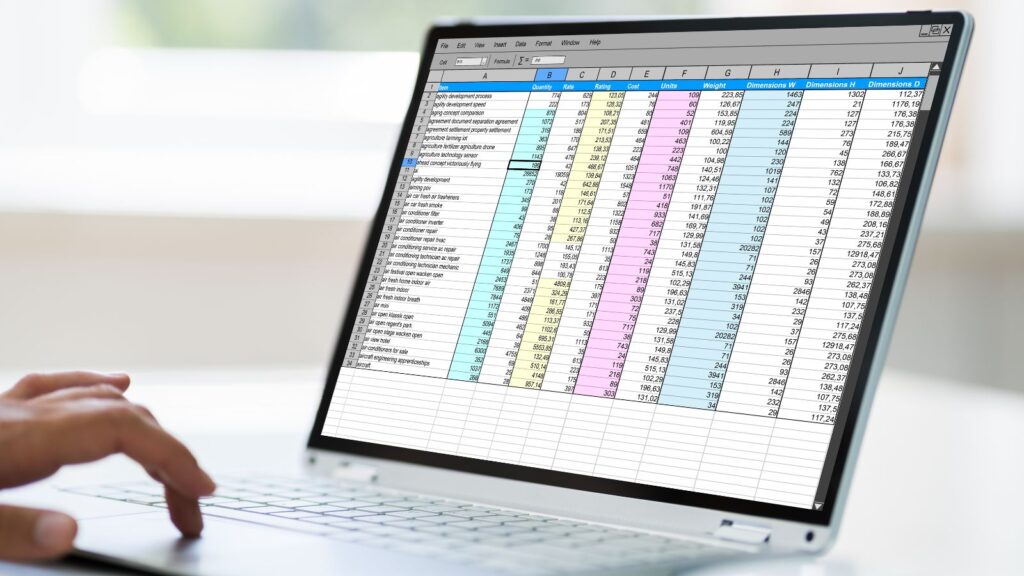
The presenter clicks to the next slide, and suddenly, the audience is hit with a blinding, edge-to-edge screenshot of an Excel spreadsheet. It contains 400 tiny cells, dense rows of decimals, and zero context. The executives in the room physically lean forward, squinting at the screen. Someone in the back inevitably asks, “Wait, what exactly am I looking at here?” In that exact second, your presentation has failed. You have lost control of the narrative.
Spreadsheets are magnificent tools for exploration. They are where you hunt for the truth, run the formulas, and find the bottom line. But presentations are tools for persuasion. When you paste a grid of raw numbers onto a slide, you are confusing the kitchen with the dining room. You are serving your audience the raw ingredients and asking them to cook the meal themselves.
We do this because translating complex Excel data into clean, visual slides is traditionally a grueling, time-consuming design chore. But that workflow is officially obsolete.
The “Data-to-Design” Bridge
The friction of moving from Excel to a presentation isn’t just about making things look pretty; it is about cognitive translation. You have to figure out which numbers actually matter and how to visualize their relationship.
This is precisely where the SkyClaw fundamentally changes your workflow. Rather than spending three hours manually building charts and aligning text boxes, you use this intelligent agent as your translator. You can feed the system your raw spreadsheet data, pivot table summaries, or key metrics. Because the AI understands business logic, it automatically parses the numbers, identifies the trends, and generates professional, geometrically sound data visualizations. It strips away the visual noise of the grid and builds a structured narrative layout in seconds.
By offloading the formatting to the machine, you can finally focus on the strategy. Here is how to stop presenting spreadsheets and start presenting stories.
Strategy 1: Stop Showing Your “Math Homework”
The biggest psychological trap analysts fall into is the need to prove they did the work. You spent a week compiling a massive dataset, so your instinct is to put every single row on the screen to justify your salary.
The audience does not care about your labor; they care about the outcome.
Before you move your data from Excel to a slide, you must ask yourself: “What is the Hero Metric?” If you are tracking 50 different product SKUs, but 80% of your revenue drop came from just three specific products, the other 47 SKUs do not belong on the slide. You can instruct your AI agent: “Analyze this sales spreadsheet. Isolate the top three underperforming SKUs. Generate a slide focusing exclusively on their revenue drop, and hide the rest of the dataset.” By actively removing the noise, you create visual gravity. You force the executives to look exactly where the problem is. If they want to see the other 47 SKUs, they can read the Excel file later. Keep the main stage ruthless and clean.
Strategy 2: Let the Machine Choose the Geometry
Humans are notoriously terrible at choosing the right charts. When faced with a column of numbers, we panic and default to a pie chart—even if that pie chart ends up having 14 tiny, unreadable slices.
Data visualization is a science. The geometry of the chart must match the relationship of the numbers.
- Are you showing a change over time? You need a line chart.
- Are you showing how individual parts build up to a total? You need a waterfall chart.
- Are you comparing two distinct periods? You need a slope graph.
When you use an AI presentation builder, you don’t have to guess. You provide the data and the intent. You prompt the system: “I need to show how our initial $2M Q1 budget was eaten away by five unexpected marketing expenses, leaving us with $100k.” The AI understands that this requires a Waterfall Chart. It automatically generates the descending graphical steps, coding the initial budget in blue, the negative expenses in red, and the final total in green. It translates your narrative intent into the correct mathematical geometry, ensuring the audience grasps the financial reality in a fraction of a second.

Strategy 3: The “Action Title” Upgrade
When you export a chart from Excel, it usually comes with a terrible, generic title generated by the software: Sales Data 2023 vs 2024.
If you leave that title on your slide, you are making a massive mistake. A title like that forces the audience to study the X and Y axes, analyze the trend lines, and try to guess the conclusion. While they are doing that math in their heads, they are completely ignoring whatever you are saying out loud.
Your slide headline must be the undeniable conclusion of the data.
You can use your AI agent to rewrite your slide headers based on the data you upload.
- Instead of: Q4 Regional Sales Performance
- The AI Generates: Q4 Sales in the Northeast Dropped 12% Due to Supply Chain Bottlenecks.
When the headline explicitly states the insight, the chart below it simply serves as the visual evidence. The audience reads the sentence, glances at the downward trend line to verify it, and then looks back at you, ready to discuss the solution.
Strategy 4: The Power of “Mute and Highlight”
Excel grids treat all data equally. Every cell is the same size; every number is the same font.
In a presentation, treating all data equally is fatal. You must use contrast to guide the eye. If you absolutely must show a complex table or a multi-line graph, you have to apply the “Mute and Highlight” technique.
This is incredibly tedious to do manually, but simple with an AI prompt. You can instruct the agent: “Generate a bar chart comparing our quarterly growth to our four main competitors. Mute the competitors by making their bars light gray. Highlight our company’s bar in bold, high-contrast brand blue.”
The complexity of the market is still visible—the executives can see the competitors’ performance—but there is zero visual confusion about where they should be looking. The stark contrast bypasses the logical brain and instantly tells the eye what matters most.
The Final Polish
An Excel spreadsheet is a magnificent calculator, but it is a terrible communicator.
Every time you paste a raw grid of numbers onto a slide, you are asking your audience to do the hard work of interpretation. You are slowing down the meeting, increasing confusion, and diluting your own authority.
Your value to the company is not your ability to read rows and columns aloud. Your value is your ability to look at a chaotic sea of data, find the single undeniable truth hidden within it, and present that truth so clearly that it forces a decision.
Stop wrestling with tiny cells and broken chart formatting. Leverage AI to bridge the gap between your analysis and your presentation. Turn your math into a visual narrative, and watch how quickly your audience goes from squinting at the screen to nodding at your strategy.