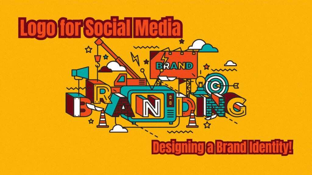
When it comes to social media, first impressions matter. A logo for social media isn’t a simple picture, but a face for a brand, a first impression at whether to join in. I’ve advised many a brand, startup, and even social media personality downplay the potential impact a well-designed logo could have, then realize down the line that it could make and break an online presence. Regardless of whether new to social media, revamping an older one, having your logo for social media in order is key.
The Most Important Things for a Successful Social Media Logo
Not all pretty, cool logos actually work for social media, though. I’ve seen many spend countless hours creating elaborate ones, then have them become an unrecognizable blob when scaled down in size for a profile picture.  If developing a logo for social media, several key factors can make a big difference.
1. Simplicity and Scalability
The biggest trap I see—heck, even I did when I first started out—is overdoing a logo. A logo that looks amazing in a website header can become a blob when scaled down in size for a tiny Instagram profile picture. Simple, unobtrusive design trumps out, hands down. Check out Twitter, for example, or Nike: simple, yet immediately recognisible, even at a quick glance.
2. Color Psychology and Branding
Colors trigger emotion, consciously or unconsciously. Have you ever noticed restaurants and food companies’ rapid use of yellow and red? Not an accident—yellow and red energize and stimulate. In social spaces, colors have an equivalent effect for brands. I recently had a client with a brilliant concept but refused to have fewer than five colors in her logo for social media. It seemed unorganized, not professional, in the long run. After a lot of persuasion (and several midnight overhauls), I convinced her to simplify it down to two colors, and her engagement increased noticeably.
3. Font Choice and Legibility
Typography is a sneaky detail most miss. I loved using cool script fonts—until I saw no one could actually read them at small font sizes. Social spaces’ logos have to have readable, bold fonts that function in a range of gadgets and platforms. Clean, modern fonts with no serif (like Arial and Helvetica) function best in social spaces for being unobtrusive and modern. In case you’re putting a lot of text in your logo for social media, try it out at a range of font sizes first.
Design Great Practices for a Social Media Logo
From testing, stumbling, and a healthy portion of headaches, I’ve gained an awareness of what works and doesn’t work for social spaces’ logos. Here are a few of the most important factors to remember:
1. Keep It Versatile Across a Variety of Gadget and Platform Combinations
I helped a fellow build a pretty, rectangle-shaped logo—only to see afterwards that it did not function in Instagram’s circular profile frame. We reworked it and re-shaped it to function in square and circle forms. Lesson: First, try your logo for social media out in a range of platforms, then lock it in.
2. Get It Seen in Profile Pictures and Thumbnails
If a logo is too similar in shape and form to background colors, it disappears. I did that with an initially white logo that merged with white background colors. Having a variation of your logo in both white and dark colors is a useful principle to follow.
3. Consistency Across All Media
I have an example in my background: I once handled a brand that changed its logo quarterly. Confused followers and a confused brand later, I have no doubt about it. Logos must have a presence in all channels—Instagram, Twitter, YouTube, and etc. Even with variation (e.g., a simple one for small screens), they must have a unifying presence.
Sizes and Variations for Social Media
Every social channel comes with its ideal logo dimensions. Not optimizing a logo can cause it to become pixelated, even getting cropped out altogether. I did that the hard way when I uploaded a soft, low-res logo for a Twitter profile—hmm, not my best work ever. Here’s a quick rundown of what actually works in practice:
- Instagram Profile Picture: 320×320 (but will actually appear 110×110 when displayed in a mobile view)
- Facebook Profile Picture: 180×180
- Twitter Profile Picture: 400×400
- YouTube Channel Icon: 800×800
- LinkedIn Profile Picture: 400×400
 For file types, PNG is a safe bet, since it doesn’t sacrifice any quality. As a bonus, when working with a designer (or faking it out, I sometimes do), request an SVG one, too—this will make future re-sizing a whole lot easier!
Instagram-Specific Logos
Instagram is a beast in a different league compared to most platforms. Because it’s such a graphical environment, a logo’s role in branding is even larger.
1. How a Logo Affects Profile Appearance in Instagram
According to Views4You, a logo for social media can make an overall aesthetic pop in an Instagram profile, but can also not work with it at all. I recently reworked an influencer whose overall feed was simply minimalist, but whose logo was a crowded, brightly-colored monstrosity. It simply did not work at all. Tweaking colors and simplifying shape helped make everything work together harmoniously.
2. How to Design a Memorable Logo for Instagram
The rounded shape of Instagram profile photos creates sharp-edged typography and logos near borders will oftentimes become truncated. I prefer working with a rounded frame in consideration in case cropping ends in awkward spaces. Have your key items centrally positioned, and nothing key will ever become obscured.
3. How to Match a Logo with an Instagram Branding Initiative
A logo isn’t a standalone entity in a vacuum – it must work with an overall brand identity. I have helped brands modify a logo for social media colors for a specific theme for a specific period, such as holidays, sales, etc. Well executed, it keeps it new and exciting without compromising recognizability.
Mistakes That Can Sabotage a Social Media Logo
Mistakes can even occur with professionals (I know, I have!). Here a few mistakes to make when creating a logo for social media:
1. Overly Complicated Designs
The temptation is to include cool overlays and little added detail, but too much detail confounds a logo and renders it unrecognizable. If it’s not pretty in a 50×50 icon, then it’s too complex.
2. Not Accounting for Platform Requirements
I have seen many make a logo that’s perfect for a website but a squashed, truncated monstrosity for social media. Always test your logo in several environments and platforms.
3. Employing Poor Quality or Non-Scalable Imagery
Nothing screams unprofessional louder than a pixelated logo. Wherever possible, use high-res files and scalable vector files in order to maintain your quality in whatever form it takes.
FAQs
1. What file format can I use for my social media logo?
Use PNG, as it can work with transparency and maintain your logo sharp. Request an SVG version, too, when working with one.
2. Can I use one logo for all platforms?
Yes, but don’t forget platform-specific cropping and re-sizing. What works for a website won’t necessarily work for Instagram, for instance.
3. How often will I have to update my social media logo?
Only when it’s out of date and no longer a reflection of your brand, and even then, don’t go changing it too often, or your followers will become confused.